How to create a multiplayer online form with Next.js and Liveblocks

Goal
In this tutorial guide, we will be building a multiplayer form where multiple users can make changes to the form fields in real-time. We will be using Liveblocks’ products (presence block and storage block) and Next.js to build our multiplayer online form. This guide aims to show how Liveblocks will be utilized to create multiplayer forms.
By the end of this guide, you will:
- Learn what Liveblocks is and how to implement multiplayer online form using Liveblocks
- Understand how Liveblocks’ presence block and storage block works
- Learn to install and connect to Liveblocks
- Learn to use some of Liveblocks hooks such as useObject(), useUpdateMyPresence() and few others
Prerequisites
To properly follow along with this tutorial, we assume you have some experience using
- Next.js
- React.js and React hooks
- JavaScript and ES6 syntax such as destructuring, arrow functions etc.
- npm
- Environment variables
If you have some experience, then you should be good to go as we assume you have installed Next.js.
Presence block and Storage block
Liveblocks presence block is what we use to indicate the “presence” of connected users and active users. This helps us identify all collaborators currently in the room.
Liveblocks storage block on the other hand is our “source of truth” for data being set or updated by all users in the room. Multiple users can edit at the same time and data is kept in sync. It also persists even after everyone leaves the room.
You can read more about Liveblocks presence and Liveblocks storage.
What exactly is a multiplayer online form
You might be wondering what this term means, well the word multiplayer simply implies more than one player. Essentially, a multiplayer online form is an online form whose content can be interacted with and changed by more than one user in real-time. This is what Liveblocks storage block helps us achieve as you are going to learn later on in this tutorial. Multiple users can login and simultaneously edit input fields of the online form or interact with its buttons and every user can see what user made those changes and where they made those changes in almost the exact time (save a few milliseconds) those changes were made.
Here is a sneak peek of what we’d be building:
We will call it Writers Club app, so get your fingers ready because we are about to start coding our project!

File structure
After you must have set up your Next.js environment, your folder structure should look similar to this:

We are going to be creating our component files and their style files in the /pages folder. We will place our authentication file in /pages/api folder. Our general styles will go into the /styles folder.
Please create a constant.js file in the pages folder and add these:
export const AVATAR_SIZE = 32;
export const COLORS = ["#E9D8A6", "#BB3E03", "#059669", "#0A9396", "#DB2777"]
This is the size we’d use for our avatars and also the colors we’d be using to indicate a user actively making changes.
We’d also share a link to the code at the end of the tutorial for your reference.
Add Liveblocks to your project
To add Liveblocks to your project, you need to run the following command in your terminal:
npm install @liveblocks/client @liveblocks/react @liveblocks/nodeThe dependencies:
@liveblocks/clientlets us connect to Liveblocks servers.@liveblocks/reactcontains React utilities to make it easier to consume@liveblocks/client@liveblocks/nodehelps us to authenticate.
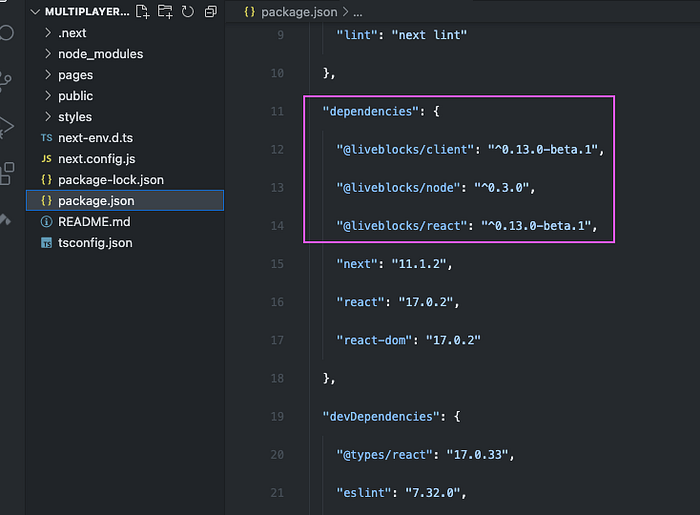
After installing Liveblocks, your package.json file should have them listed like so:
Authentication
To use Liveblocks, we have to authenticate using our secret key. Create a file in the pages/api folder and name it auth.js.
Also, we are going to use userInfo field to add information about the current user that will not be changed throughout the session. This is helpful to implement user’s avatar/image or display the user’s name to indicate their presence for identification purpose.
kindly note that you need to have access to the private beta for the storage block. Please contact Liveblocks at hello@liveblocks.io if you want access to the storage block private beta
For this tutorial, we’ll use random names and random avatars to indicate the presence of a user. Here is the code snippet of what the auth.js file should look like.
import { authorize } from "@liveblocks/node";// Create and environment variable and add your liveblocks secret_keyconst API_KEY = process.env.LIVEBLOCKS_SECRET_KEY;export default async function auth(req, res) {/* You can implement your security checks here just like we did below */if (!API_KEY) {
  return res.status(403).end();
}// For the avatar example, we're generating random users
// We will also generate random names for the user
// and set their info from the authentication endpoint
// See https://liveblocks.io/docs/api-reference/liveblocks-node#authorize for more informationconst response = await authorize({
  room: req.body.room,
  secret: API_KEY,
  userInfo: {
    name: NAMES[Math.floor(Math.random() * NAMES.length)],
    picture: `/assets/avatars/${Math.floor(Math.random() * 10)}.png`,
  }
});  return res.status(response.status).end(response.body);
}const NAMES = [
  "Ikeh Akinyemi",
  "Naru Designs",
  "Steve Fabre",
  "Guillaume Salles",
  "Fortune Kay"
];
Connect to Liveblocks server
Inside the pages folder, create a file and name it _app.js. In this file, we will connect to Liveblocks and create a client. A Liveblocks client is responsible for communicating with Liveblocks servers. You can create a client using your public key but in this tutorial, we’d be using the authEndpoint to handle authentication in our auth.js file that would be created later on in the pages/api folder.
import "../styles/globals.css";
import { createClient } from "@liveblocks/client";
import { LiveblocksProvider, RoomProvider } from "@liveblocks/react";
import React from "react";//create liveblocks clientconst client = createClient({
  authEndpoint: "/api/auth",
});function MyApp({ Component, pageProps }) {
  return (
     <LiveblocksProvider client={client}>
       <RoomProvider id="writers-club">
         <Component {...pageProps} />
       </RoomProvider>
     </LiveblocksProvider>
  );
}export default MyApp;
Create multiplayer form
This is where we’ll use the Liveblocks presence block and storage block to create the multiplayer form where all the users can collaborate. Here are some of the Liveblocks hooks we will be importing, and what we will be using them for:
useOthers()we will use this to get info about other users connected in the room.useUpdateMyPresence()we will use this to update presence of the current user, show what form element is currently in focus and which user is acting on them.useSelf()we will use this to get info of the current user once the user is connected to the room.useObject()— this returns theliveObjectassociated with the provided key (which we used during authentication). We will create our initial data (state) which will be stored in Liveblocks storage block and share the state with all connected users using this hook.
For more information: see useObject(). Data is created using this hook like so:
//initial dataconst data = useObject("editor", {
  title: "Title",
  content: "Content",
  theme: "light",
});
And to update the data we’ll use the set() method as below:
data.set("title", e.target.value);In this tutorial, we will not cover how to implement live avatars, you can learn about this in another article here. The avatars are the pictorial representation of current users that are online.
Navigate to the pages folder and create a file Avatar.js and update it with the below component code snippet:
import React from "react";
import styles from "./Avatar.module.css";
import { AVATAR_SIZE } from "./constants";export default function Avatar({ picture, name, color }) {
  return (    <div className={styles.avatar} style={{ width: `${AVATAR_SIZE}px`, height: `${AVATAR_SIZE}px`, boxShadow: color ? `0 0 0 1px var(--color-background), 0 0 0 3px ${color}` : undefined, }} data-tooltip={name} >     <img src={picture} height={AVATAR_SIZE} width={AVATAR_SIZE} className={styles.avatar_image} style={{ border: color ? `1px solid var(--color-background)` : undefined, }} />   </div>
 );
}
Next, we have to style our avatar component. Create a file Avatar.module.css file and add the below code snippet:
.avatar {
  position: relative;
  border-radius: 50% 50%;
  margin: 0 6px;
}.avatar:before {
  content: attr(data-tooltip);
  position: absolute;
  top: -32px;
  opacity: 0;
  padding: 4px 8px;
  color: white;
  font-size: 12px;
  left: 50%;
  transform: translateX(-50%);
  border-radius: 4px;
  z-index: 1;
  background: rgba(0, 0, 0, 0.96);
  white-space: nowrap;
}.avatar:hover:before {
  opacity: 1;
}.avatar:not([data-tooltip-persistent]):before {
  pointer-events: none;
}.avatar_image {
  border-radius: 50% 50%;
}
Create Selection component
With the Selection component, we will be able to indicate the presence of the user currently online and is making changes to the form. Within the /pages folder, create a Selection.js file and add the code snippet:
import React from "react";import styles from "./Selection.module.css";export default function Selection({name, color}) {return (
  <div className={styles.selection}>
    <div className={styles.selection_border} style={{ borderColor: color, }} />
      <div className={styles.selection_name} style={{ background: color }}>
      {name}
      </div>
    </div>
  </div> );
}
To style this component, create a Selection.module.css file in the pages folder and add the following code snippet:
.selection {
  position: absolute;
  pointer-events: none;
  top: 0;
  right: 0;
  bottom: 0;
  left: 0;
}.selection_border {
  position: absolute;
  top: -5px;
  right: -5px;
  bottom: -5px;
  left: -5px;
  border-radius: 11px;
  opacity: 0.2;
  border-width: 5px;
  border-style: solid;
}.selection_name {
  position: absolute;
  top: -29px;
  padding: 0 6px;
  border-radius: 3px;
  font-size: 12px;
  line-height: 20px;
  height: 20px;
  color: white;
  right: 0;
}
Create MultiplayerForm component
Next we will build our Multiplayer online form using the 3 main components we discussed earlier. These 3 main components are:
MultiplayerFormcomponent: which contains the form itself and the preview part. It will also house all other components.Avatarscomponent: this will wrap the avatars of all connected users.Selectionscomponent: this will house the Selection component which we added above.
Whenever any of the form elements, input, textarea, or button is on focus, we will update the presence with the id of the form element. When it is blurred, we will update the presence with null. This id is passed to the Selections which re-renders the Selection component based on the id and then the Selection component indicates which user is actively taking actions on the form element.
When a change is made to a form element, input or textarea, or a button is clicked, we update the data value in the storage block simultaneously with the value of the element or the corresponding theme to the button which was clicked.
Next, create an index.js file in the pages folder. This file is the primary file of our application that will be rendered in our browser. The index.js contains the MultiplayerForm component which contains all of our other components.
The full code snippet for the MultiplayerForm component can be found here. And within the index.js file, we will focus on the below code snippet to illustrate the above explanation:
<div className={styles.selection_container}>  <input id="input-name" type="text" className={styles.input} value={title} onFocus={(e) => updateMyPresence({ focusedId: e.target.id })} onBlur={() => updateMyPresence({ focusedId: null })} onChange {(e) => { data.set("title", e.target.value); }} maxLength={20} />

  <Selections id="input-name" />
</div>
Now we are done coding our application, let’s view the final working UI by simply running the following command. This would open the application on localhost:3000 for preview.
npm run devConclusions
The Liveblocks presence block and storage block are awesome products to build collaborative projects. While presence handles user identification to prevent conflicts, storage block keeps a shared state between all connected users. One user makes a change and all connected users are aware simultaneously (at once). Even when everyone leaves the room, this state persists and the users can return to meet the same data state.
The full codebase for the project can be found on GitHub. And that marks the end of the tutorial, thank you for sticking around!